App signup drop-off: what to check before you redesign it
Losing people at signup? Find where they leave, what each drop points to, and what to ask your team before you commission a redesign.
· 9 min read
People install your app, open it once and never finish signing up. Installs look healthy, yet the number of real accounts stays low. The usual reaction is to ask for a redesign. A redesign is the right answer only when you know which step loses people, and most owners have never seen that step written down.
In short
- Count people at every step first. From the store page to the first useful moment in the app, write down how many people reach each step. The biggest gap between two steps is where the work starts.
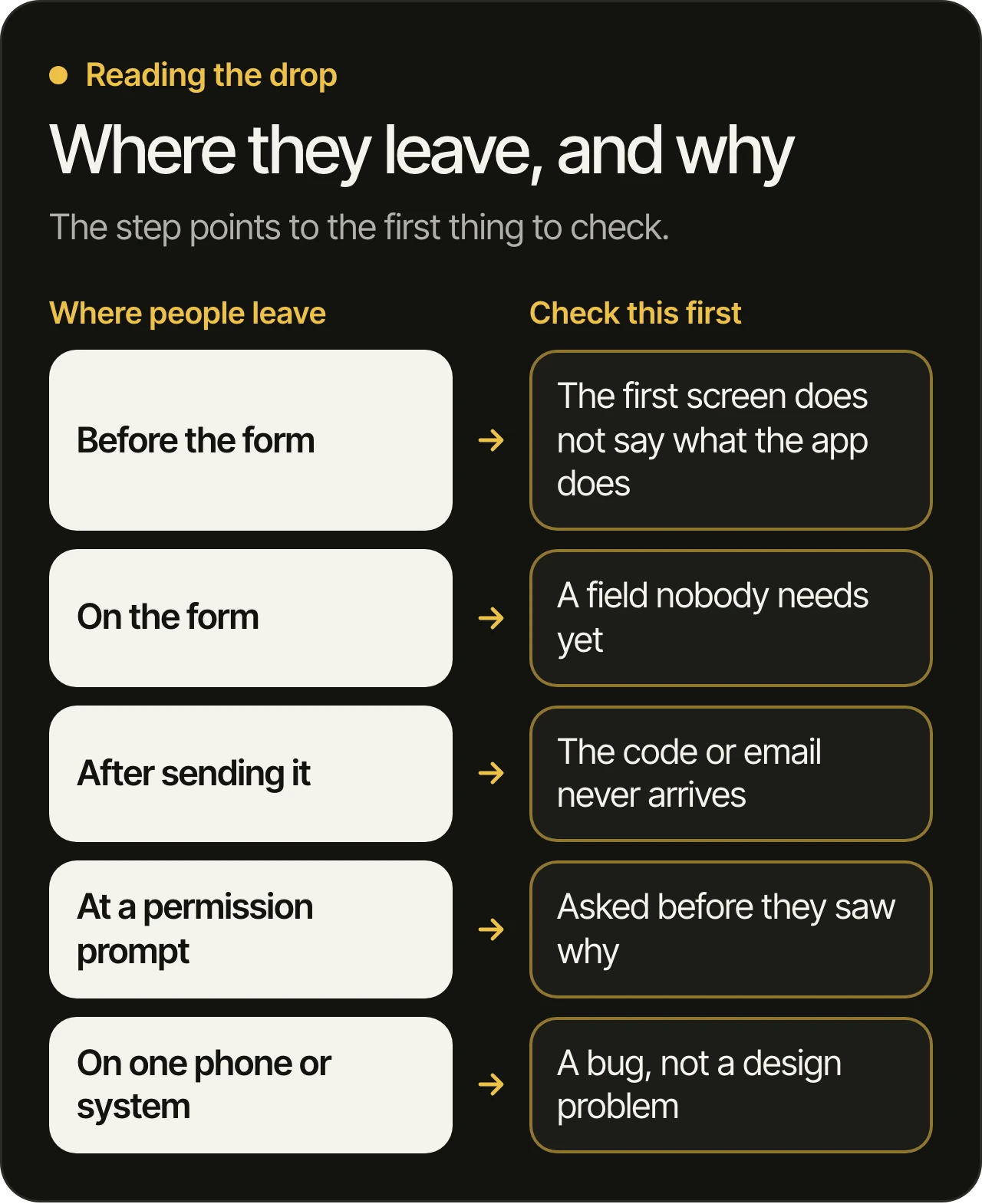
- Where people leave tells you what to check. Leaving before the form, on the form, after sending it or at a permission prompt are four different problems with four different fixes.
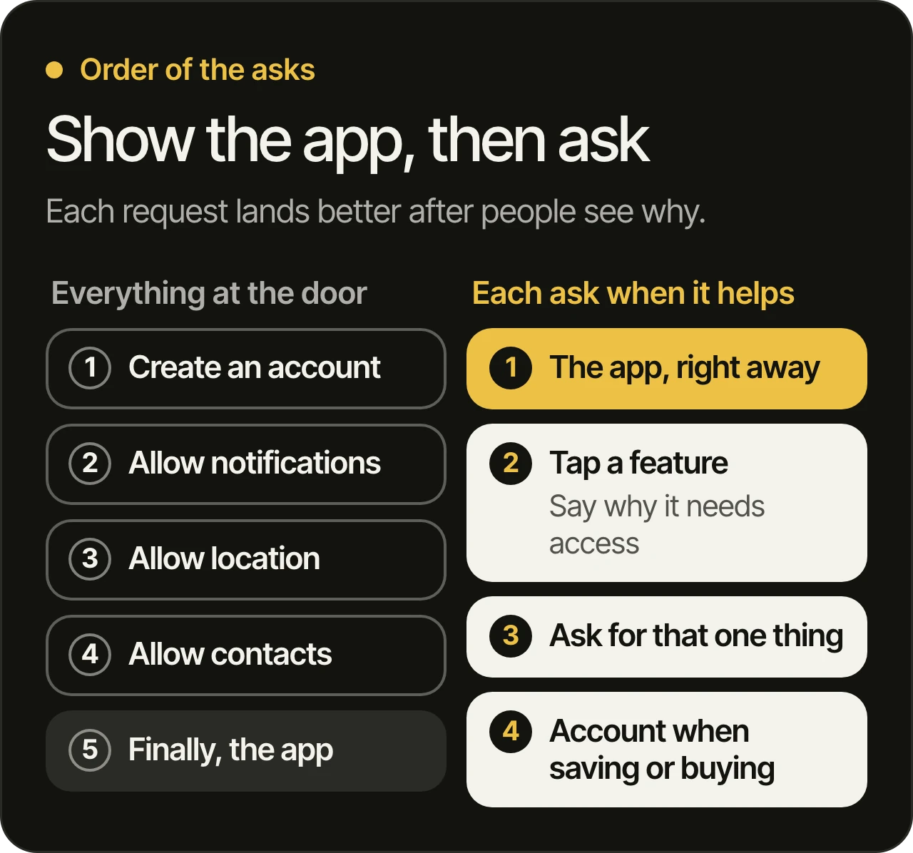
- Ask for less, and ask later. Apple’s design guidelines say to ask people to create an account only if your core functionality requires it, and to delay sign-in for as long as possible.
- Check for a bug before you blame the design. If people leave on one phone model or one system version only, the screen is probably broken, and no redesign will fix that.
First, find out where people leave
You cannot fix a drop you have not located. Write the path from the first sight of your app to the moment it becomes useful, and count the people at each step.
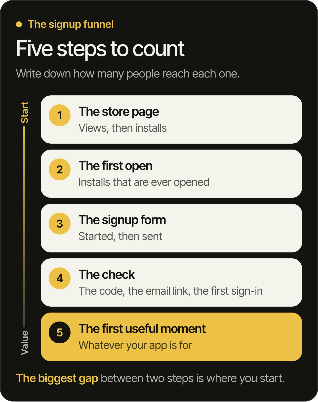
Your two stores can tell you about the first steps, and your own analytics has to tell you about the rest. The steps inside the app only show up if someone built the tracking for them, which is a question worth asking before anything else. A form that can be started and sent needs two events, not one, and the check that follows needs its own.
Two habits make the numbers honest:
- Split by platform. One blended figure can hide that the drop is on one system only. If your Android users leave at a step where your iPhone users do not, you have probably found a bug, and that changes what you do next.
- Compare like with like. Compare the same steps over the same date range, and compare people, not events. One person who retries five times is still one person.
If you have no step-by-step numbers yet, do not wait for a redesign to get them. Adding the tracking is usually a small change, and every later decision gets easier. It also belongs in the written audit that starts a product takeover, and why apps fail after launch explains how we decide what to fix first.
What each drop points to
Once you know the step, you know where to look first. These are the patterns we see most often. They are starting points, and your own data decides.
Before the form
People who open the app and leave without touching the form have not been told what the app is for, or they were asked for something before they saw any value. Look at the first screen as a stranger would. Does it say in plain words what the app does for them, and can they try something before they commit?
On the form
Every field is a reason to stop. Go through the form one field at a time and ask what you do with the answer early on. A birth date, a second phone number and a company size can usually wait until the person has a reason to give them. Apple’s App Review Guidelines say that apps should only collect and use data that is required to accomplish the task at hand.
After sending it
This one is the easiest to miss, because the form itself works. The person is waiting for a code that arrives late, lands in a spam folder or never comes. Or they tap the link in the email and land on a page that does not open the app. Try the whole path yourself on a fresh phone with a new email address, on both platforms, and watch what happens.
At a permission prompt
A system prompt that appears in the first seconds, before the person has seen anything, gets a quick “no”. On Android, a second denial means the system will not show that prompt again, and Android’s guide warns that asking too early can cost you the chance to ask later. We come back to this below.
On one phone or system only
A drop that appears on one model or one system version is almost never a design problem. Look at the crash reports for that step, as we describe in how to read app crash reports. A signup screen that crashes for some people looks, in the funnel, exactly like people who changed their minds.
Ask for less, and ask later
The three things an app asks for at the start are an account, personal details and permissions. All three have official guidance, and it points the same way: later, and only what is needed.
The account
Apple’s guidelines on managing accounts (opens in a new tab) say to ask people to create an account only if your core functionality requires it, and otherwise to let people enjoy the app without one. They also say that people often abandon apps when they are forced to sign in before they can do anything useful, and give a shopping app as the example: browse as much as you want, sign in when you are ready to buy.
This is also a store rule. Apple’s App Review Guidelines (opens in a new tab) say that if your app does not include significant account-based features, people should be able to use it without a login. They also say that an app which supports account creation must offer account deletion inside the app. If your signup was built without either, ask your team about both.
The sign-in method
Passwords add steps to signup. Apple’s guidelines say to consider Sign in with Apple, and, when you do not use it, to prefer a passkey, which lets people give a user name and skip the password. On Android, Google’s Credential Manager (opens in a new tab) brings passkeys, Google sign-in and passwords into one sign-in sheet, and Google says its unified interface improves registration and sign-in speeds. Whichever you choose, say plainly what each button does.
The permissions
Apple’s privacy guidelines (opens in a new tab) say to request permission only when your app clearly needs access, and to avoid asking at launch unless the data is required for the app to function. A navigation app asking for location on the first screen makes sense. A shopping app asking for contacts on the first screen rarely does. Android’s guide to requesting permissions (opens in a new tab) gives the same principle: ask in context, when the person starts to use the feature that needs it, and if they say no, keep the rest of the app working.
The words in the prompt matter too. Apple asks for a short, specific sentence that says how the app uses the data, and calls “Microphone access is needed for a better experience” a vague example. If you show a screen of your own before the system prompt, Apple says to give it a single button that opens the prompt, labelled something like “Continue”.
The tour
Apple’s onboarding guidance (opens in a new tab) asks for a flow that is fast, fun and optional, and says that, ideally, people understand an app simply by using it. It also says to postpone nonessential setup and to provide sensible default settings, so most people can begin straight away. A five-screen tour that explains buttons people have not yet seen is usually the first thing to cut.
Find out why before you redesign
The funnel says where. It does not say why. Before any design work, spend a little time with the evidence you already have:
- Watch real people try it. A handful of people who have never seen the app, on their own phones, will show you more than another meeting. Say nothing and write down where they hesitate.
- Read the reviews and support emails for the step. People who could not sign in say so. We explain how to sort them in how to analyze app store reviews.
- Ask the people who left. A short message to people who started signup and did not finish, with one question about what stopped them, can get honest answers.
- Check that the path works. Codes, links, emails and permission prompts on a fresh phone, on both platforms.
If these show a broken flow, the next question is how big the repair is. We cover that in should you rebuild your app from scratch. If it points to the screens, a careful design review of this one flow is a smaller step than a full redesign, and how to judge a UI/UX agency lists what to ask of whoever does it.
What to ask your team before you approve a redesign
Each question has a plain answer, and the answer shows whether anyone has looked at the signup.
- Which step loses the most people, and on which platform? You should get a step and a platform, not a general feeling.
- How do we know? The answer should name the tracking, not a guess.
- What is each field on the form used for? A field with no use early on is a candidate to remove.
- Does the app work without an account for anything? If it could, what would it take?
- When do we ask for each permission, and what does the person see first? The answer should be the moment the feature is used.
- How will we know the change worked? Agree the step and the date range before the change ships, so the result can be read afterwards.
Questions owners ask
Should people be able to use the app without an account?
Whenever your core functionality allows it. Apple’s guidelines say to require an account only if the core functionality needs one, and its review rules ask apps without significant account-based features to work without a login. Many apps can show their value first and ask for an account when someone wants to save, buy or come back.
Is a short onboarding tour better than none?
Apple’s guidance says that, ideally, people understand an app simply by using it, and that onboarding, when needed, should be fast and optional. A short tour makes sense when the app has a step people cannot guess. A long one that explains obvious screens only delays the first useful moment.
Why do people leave after they send the signup form?
Look at the check that follows it. A code that arrives late or not at all, an email link that opens the wrong page and a first sign-in that fails all look like people changing their minds in the numbers. Try the full path on a fresh phone, on both platforms, before you change any screen.
What if we have never tracked the signup steps?
Add the tracking first. Until it has collected enough people, use what you already have: the stores’ own reports, the reviews, the support emails and a few people trying the app in front of you. That is enough to find the likely step, and the tracking will confirm it.
How do we know a redesign of the flow worked?
Choose the step and the date range before the change ships, then compare the same step over the same range afterwards, split by platform. Change one thing at a time where you can, so you know which change did the work.
What to do next
Signup is where your product meets its first strangers, so it deserves the same care as any other part of the business. Find the step, find the reason and make the smallest change that fixes it. If you would like a second pair of eyes on your numbers, we go through your product before the free 45-minute consultation and show you what we would look at first. You can also read about how we work.